Fractal time: Announcing Lyapunovia’21

Fractal time: Here’s Lyapunovia’21, a remake of my 1992-93 (yes) Amiga program of the same name.
A “mindbogglingly colorful” realtime & animated fractal; a small side project almost entirely unrelated to what I think is my career. Free, creative commons, and playable in your browser. 

The History of Lyapunovia

“Lyapunovia: Displaying the Juiciest Object in Mathematics.
Lyapunovia is a mindbogglingly colorful program that makes pictures from a simple mathematical formula … offering you everything you ever wanted in visual representation of mathematical abstractions.”

-Me in 1992.

This new version came about when I saw that a modern computer – or phone – can easily render a fractal like this in real time using the graphics card.

In this new version, I focused on making the user experience fun, on making it pleasurable to navigate around the fractal image. I have also animated the fractal a bit, so the goal is not to arrive at the final image, but to explore a strange animated object.

Backstory

Lyapunov Space fractals were created by Mario Markus in the late 1980’s, and probably popularized by Dewdney’s 1991 article in Scientific American.

Having read the Scientific American article, I wrote the Lyapunovia fractal program for the Commodore Amiga in 1992-93. This was just around the peak of shareware, and users could physically mail me payment for a full version of the program, which I’d dutifully send them on floppy disks. Version 1.5 was released the following year, now supporting new Amiga 1200 and 4000 computers with their fancy new graphics chipsets, and switched to a more convenient donation model. (Here is the original readme file.) I probably sold and received literally *many dozens* of contributions, so I was happy.

After that, a made a small version for long gone BeOS, and dabbled in a PC version.

Lyapunovia had a weird role in my life. It made a tiny bit of money for a poor student, but it also heavily distracted me from actual studying, which in some ways would have been better for me, yet I got hired by my future multimedia workplace MouseHouse because they’d seen the program and called me up. Going back to Lyapunovia gives me an intense feeling of where it was made, “while watching the tiny little bit of blue sky I can see from my room if I push my head flat against the window and look directly up”, as the readme file says.

My later life has become something else – writing books about video game theory, occasionally making games, and continually teaching students to make, think, and write about video games.

My original training though, just before Lyapunovia, was in demo culture, and from that I probably brought the idea that programming (which I enjoy) can also be visible and understandable to non-programmers as well. I have mostly channeled this into games, but why not try the fractal thing gain?

What do fractals mean?

In their 1990ish heyday, I think fractals represented both the future, modern technology, and then-new ideas of chaos and emergence. Today there’s something retroish about them. Yes, we know that small formulas can create complex patterns, but the actual speed of modern computers (coming here from the graphics card of your device) makes fractals immediate in a way they were not.

Clearly, I am making choices here about how to represent Lyapunov Space, but that experience is always one of the formulas having an emergent mind of their own. The fractal doesn’t care about us, and I think this gives a feeling of “sublime banality” – a fractal is vast, infinite, and incomprehensible to our human minds, but it also doesn’t ask anything from us. Other words: Alien, reptilian. It’s a lot like deliberately electronic music, which can be read as life-affirming by showing us how we’re either wonderfully alive unlike the mechanical world, or that we’re wonderfully mechanical as well, or that we are freed from having to fall into established categories. Here’s to that.

Programming then and now

The Amiga program was gigantic, and the mental work was very hard, figuring out how to do things I did not know how to do; writing and rewriting the code, waiting for the program to render, writing the image saving routines, and so on. This was a huge undertaking for me.

This new version was made quickly (~20 hours), it is pretty small, but as is the case with modern web development, it includes 4 entirely different languages – HTML, CSS, JavaScript, and GLSL. The main challenge here has really been to read up on all the documentation, like the weird limitations of the GLSL version I was using. Thanks to WebGLFundamentals for the best WebGL explanations. I have also focused on designing a pleasurable interface that could be used across a range of devices. The idea of the pleasurable interface wasn’t really common in 1992 (except in games).


The Deletionist: Erasure Poetry from any Web Page

delitionist_logo[1]

Announcing The Deletionist, a project by Amaranth BorsukNick Montfort and myself.

This is a bookmarklet (added to the bookmark bar in one’s browser) that automatically creates erasure poetry from any page on the World Wide Web, revealing an alternate mesh of texts called the Worl. Amaranth and Nick presented The Deletionist for the first time this week at the E-Poetry festival in London, at Kingston University. http://thedeletionist.com/

For every page, The Deletionist weighs 30 different principles of erasure to see which is most appropriate for a given text.

Please post any interesting examples that you may find by tweeting @thedeletionist or posting here!

Examples

Games Telling stories

www.gamestudies.org-0101-juul-gts-

This is the alliteration rule – this guy’s clearly obsessed with the word “narrative”!

Waxy.org  (example by waxy.org)

deletionist-waxy-20130618-212909[1]

The “it’s not you it’s me”-rule.

Susan Sontag: Against Interpretation

www.coldbacon.com-writing-sontag-againstinterpretation.html

The Steinian Continuous Present rule.

Bioshock Infinite ending spoiler

Understanding

Readable, without spoiling much! The “I am Interesting” rule.

Introducing the Not Helvetica Collection

We love Helvetica! We really do!

But do you ever feel uneasy over its excessively clean lines?

Suspicious of the self-conscious foot of the upper case R?

Disturbed by the smug purists who think they have found the Eight Wonder of the World?

Then I have something for you.

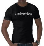
A wholly frivolous side project, I present to you the NotHelvetica collection: a modest line of apparel and household objects featuring classic good-taste fonts like Helvetica, Bauhaus, and Futura … only in, well, other fonts like Comic Sans, or Old English, or Rosewood.


 Get the T-shirt
.


The iPhone 5 case
.


The cosmetic bag
.

And more! All customizable.

http://www.not-helvetica.com/

Thanks!

-Jesper

PS. For the truly daring contrarian, the Helvetica in Arial T-shirt is now available!

Is Tetris copyrightable? [In the US]

[Update: EA is suing Zynga for copying The Sims Social in The Ville.]

Here’s a recent court case on a question that keeps popping up: can a video game be copyrighted? (In the US that is.)

THE TETRIS COMPANY vs. XIO INTERACTIVE, INC.

The Tetris Company sued Xio for copyright infringement for the game Mino. The judge has  ruled against Xio, and hence for the present and future ability of the Tetris Company to sue apparent Tetris clones.

Not being a legal scholar, here are some things I find interesting: Overall, the case doesn’t differ too much in general layout from previous court cases, and it cites generously from previous cases regarding the copyrightability of video games.

The main question concerns the “idea-expression” dichotomy, where by convention an idea is not copyrightable, but the expression of an idea is:

“protection is given only to the expression of the idea—not the idea itself.”

Hence the question really is what parts of Tetris is an idea, and what parts are an expression of that idea. The Tetris company specifically claims that these 14 points are expression:

1. Seven Tetrimino playing pieces made up of four equally-sized square joined at their sides;

2. The visual delineation of individual blocks that comprise each Tetrimino piece and the display of their borders;

3. The bright, distinct colors used for each of the Tetrimino pieces;

4. A tall, rectangular playfield (or matrix), 10 blocks wide and 20 blocks tall;

5. The appearance of Tetriminos moving from the top of the playfield to its bottom;

6. The way the Tetrimino pieces appear to move and rotate in the playfield;

7. The small display near the playfield that shows the next playing piece to appear in the playfield;

8. The particular starting orientation of the Tetriminos, both at the top of the screen and as shown in the “next piece” display;

9. The display of a “shadow” piece beneath the Tetriminos as they fall;

10. The color change when the Tetriminos enter lock-down mode;

11. When a horizontal line fills across the playfield with blocks, the line disappears, and the remaining pieces appear to consolidate downward;

12. The appearance of individual blocks automatically filling in the playfield from the bottom to the top when the game is over;

13. The display of “garbage lines” with at least one missing block in random order; and

14. The screen layout in multiplayer versions with the player’s matrix appearing most prominently on the screen and the opponents’ matrixes appearing smaller than the player’s matrix and to the side of the player’s matrix.

The judge does not make a decision for every single claim, but much of the argument concerns whether Mino could have made other decisions than have same size playfield, ghost pieces, and so on. The judge says:

In addition to the design and movement of the playing pieces … I find the following elements are also protected expression and further support a finding of infringement: the dimensions of the playing field, the display of “garbage” lines, the appearance of “ghost” or shadow pieces, the display of the next piece to fall, the change in color of the pieces when they lock with the accumulated pieces, and the appearance of squares automatically filling in the game board when the game is over. None of these elements are part of the idea (or the rules or the functionality) of Tetris, but rather are means of expressing those ideas.

And there you have it. As I read it, this decision seems to pull more game elements into the domain of expression (and hence copyright) than previous decisions did, but I will leave that analysis to others.

(Ars Technica also has a writeup here.)

Tablets are Dead (history tells us so)

Behold the cover of the latest issue of Wired:

Behold the article “How the Tablet Will Change the World“.

Compare to another Wired prediction, from 1997. The browser is dead and will be replaced by “push” technology:

This is not to say that the iPad will fail.

But if history has taught us anything, it’s this: If something is on the cover of Wired, it’s future is in serious jeopardy. Iridium. The Long Boom. Sega.

Perhaps this is what Wired is: Current trends, extrapolated to the max, made into the strongest possible predictions about the future.

Peter Bøgh Andersen, 1945-2010

Mark Bernstein brings the news that Peter Bøgh Andersen died this week.

Peter played an important role on my journey through academia by serving on my PhD committee in 2004. He was a semiotician in the best possible sense, where it meant that no question was out of bounds, and that all media, art forms and human endeavors were therefore necessarily interesting, as his web page attests.

Hence, he was always a great discussion partner for a young researcher looking at an underexplored phenomenon such as video games, and he was the first person I ever heard give a convincing account of interactivity, back in the mid-1990’s when interactivity was used left and right. “Look, you need to distinguish between interactivity on the level of the plot, and interactivity on the level of the story”.